|
This time around we are talking about Space and Depth. How artists and designers are able to give dimension to a piece that is otherwise presented in a 2D space. Whether on a canvas, a screen, or in virtual reality, space and depth is developed as an illusion. Below is the glossary for this discussion.
Thank you for following along with this design blog.
As always, feel free to leave a comment/suggestion/feedback down below.
0 Comments
In discussing value, you begin to see how intertwined these really are. Value can be used to build depth, texture, contrast. Its hard to talk about value in a piece without involving the others. Below is the glossary for this discussion.
Thank you for following along with this design blog.
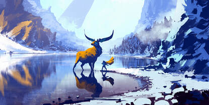
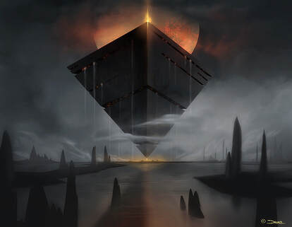
As always, feel free to leave a comment/suggestion/feedback down below. Color is perhaps my favorite discussion in design. This small spectrum of electromagnetic wavelengths that our eyes can perceive into vivid worlds and emotional narratives is truly fascinating. It becomes even more fascinating when we use technology, like geographic information systems, to present the colorless in color. Below is a glossary of vocabulary used for this discussion. In Netflix series, The Midnight Gospel, color is used in an abstract and emotional method to convey the journey of the interview. For those unfamiliar with the series, the main character interviews real life figures of philosophy about existential questions. While these interviews are very much real, the animation that is connected to it are completely abstract fiction. Through color the show is able to build depth through the scenes, utilizing brightness and saturation to build foreground, midground, and background. You can even notice a strong use of gradients to build dimension of objects to show a transition in the plane of space. Given the premise of this show, it wouldn't surprise me at all if they designed the art entirely around color psychology. Key scenes through the slide show above, present color schemes that can invoke a particular emotion. For example, the scene where Clancy, the main character, sits with his keyboard and plays a song. The background is mostly cool colors, while the foreground is mixed with warmer yellows and pinks. While this helps with building depth in the scene, it also creates a sense of relaxation, like being on a yellow sand beach with the ocean and sky ahead of you. Thank you again for following along as I explore the elements of design. As always feel free to leave a comment/suggestion/feedback down below.
This week we've discussed Shape as the form objects we observe in space and on medium. Shapes have been used consciously and unconsciously to imbue symbolism and emotion. Below is the glossary we will be using in this blog.
Lines are very definitive for perception and understanding of the space around us. In a way line of sight is always being drawn from our eyes out into the world that scan and identify the forms and patterns that we assign meaning. In class we've been given a defined glossary of Line.
Thank you for reading this post as I go into my perception of line and how I see it in media.
As always feel free to leave comments, feedback, or your own analysis of the pieces you think use lines well. |
AuthorThis blog was for the purpose of AET 315, where we explore design thinking and principles. Here I will explore my own design methods and perspective. Archives |


 RSS Feed
